A New Look for Blue
A new wordmark, a circle, and the year that led to them — 10,966 commits and 206 shipped changes, with three months still to go.
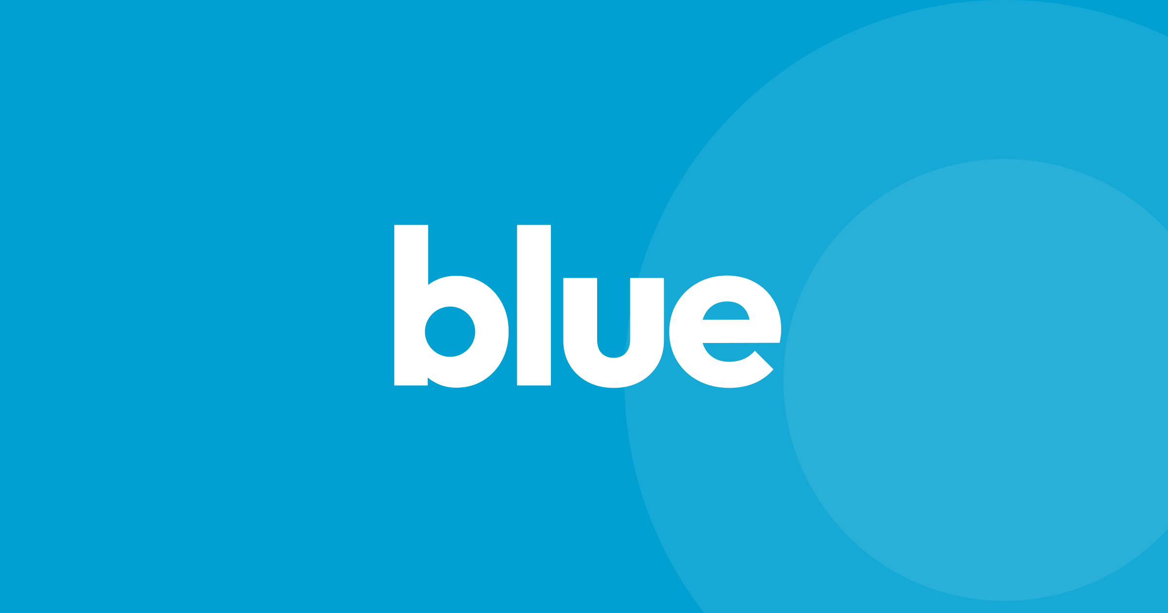
Blue looks different today.
The product has changed more this year than in any year before it, and the old logo stopped matching what it sits on. So it has a new one.
The word
The old wordmark was a capital “Blue” in a heavy weight of Inter, the same typeface as the product. It was clean, but it was a font, not a mark.
The new one is lowercase, set in Outfit Bold. I changed exactly one thing about it: the hole inside the “b” is now a perfect circle. In the original typeface it’s close, but about 3% off at its worst. You won’t see the correction. You’ll just see something round.
The circle
That circle is Blue’s new symbol. It’s the app icon, the favicon and Blue’s avatar. It never sits beside the word. It lives inside it.
It also moves. Scroll this page and watch the top-left corner: the word folds into the circle. Hover it, and it unfolds again.
Loading, in colour
The first thing you see when you open Blue is now the circle, pulsing while your workspace loads. When everything is ready, it floods the screen and gets out of the way.
If you run Blue under your own brand, the circle is your colour, not Blue’s. From the very first frame.
Why now
A logo isn’t worth changing for its own sake. This one changed because the product under it did.
From 2018 to the end of 2025, Blue’s codebase received about 12,100 commits. This year alone: 10,966, and there are three months to go. That became 206 entries in the changelog, one shipped change most days.
Some of the bigger ones:
- One price, once. Buy Blue, own it. No subscription.
- Off the cloud. Blue’s own servers, run by its own deployment platform.
- Instant queries. Large workspaces open in the blink of an eye.
- A million records. Limits that beat every major platform, at every tier.
- Native AI agents. An agent built into Blue, not bolted on.
And in September alone: offline mode, field history, customisable keyboard shortcuts, data quality dashboards and ZIP downloads for folders.
Everything in one place
The wordmark, the symbol, the app icons and the colours are on the brand page, for anyone who needs them.
Same Blue. New look.