Stat Cards
Create a stat card to show calculated record values from one or more databases.
Stat cards show real-time calculated values from one or more databases. Use them to monitor record counts or numeric field data.

Create a stat card
- Open a dashboard.
- Select Add chart > Stat Card. Blue adds the card and opens the Edit chart panel.
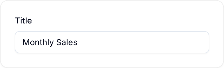
- Enter a Title that identifies the metric. Examples include “Monthly Sales,” “Open Issues,” and “Weekly Active Users.”
- Under Data, select Edit formula. Blue opens the Edit values dialog.
- Add at least one value. See Add values.
- In the Edit values dialog, select Save.
- In the Edit chart panel, configure the display and select Save.
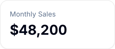
Blue shows the title at the top of the stat card.
Add values
A value has a title, a color, one or more sources, and an optional formula. Each source reads records from one database.
- In the Edit values dialog, expand a value and enter its Title.
- In the source row, select the workspace.
- Select the Database. Blue cannot save a source without a database.
- Under Field, select Records to count records, or select a numeric field of that database.
- If you selected a field, select the aggregation: Sum, Count, CountA, Average, AverageA, Min, or Max.
- Optional: Select Add filter to limit the records in this source. See Filters.
- Optional: Select Add source to add another source to the value.
- Optional: Select Add value to add another value.
Numeric fields can be Number, Currency, Percent, Rating, Formula, Time duration, and Currency conversion fields. Blue describes a source as {database}: {aggregation} of {field}.
If a source shows This database is no longer available or This field is no longer mounted on the database, select another database or field.
Add a formula
Use a formula to calculate a value from its sources.
- Under Formula, type
{to open the list of sources. - Select the sources to include in the formula.
- Type
=to open the function list. - Select a function.
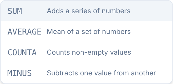
Available functions include:
- AVERAGE: Calculates the mean of a set of numbers.
- AVERAGEA: Calculates the average and treats text as zero.
- COUNT: Counts entries in a number field.
- COUNTA: Counts non-empty values.
- MAX: Returns the maximum value in a set.
- MIN: Returns the minimum value in a set.
- MINUS: Subtracts one value from another.
- MULTIPLY: Multiplies two values.
- SUM: Adds a series of numbers.
Configure the display
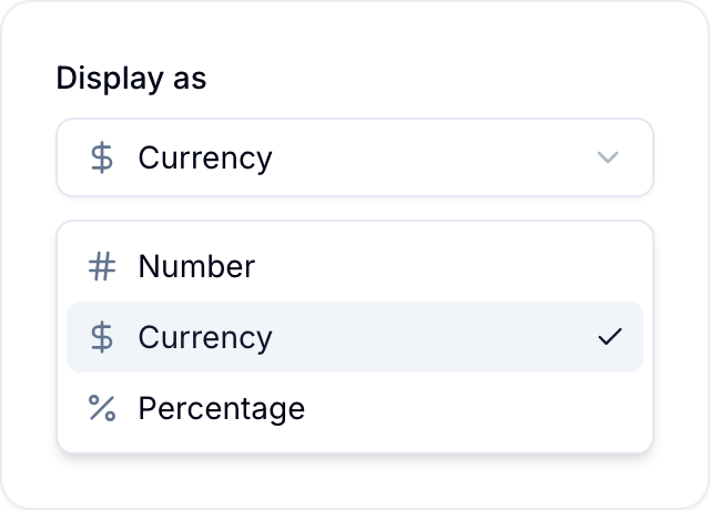
Under Display as, select how the stat card displays its calculated value:
- Number: Shows a number.
- Currency: Shows a monetary value with local formatting and a currency symbol.
- Percentage: Converts the calculated value to percentage format.
Under Decimals, enter the number of decimal places, from 0 to 4.
Track progress against a target
A number on its own tells you where you are, not whether that is good. A card with a target also shows how far along you are, how much is left, and whether you are on track.
Add a target card in one of these ways:
- Select Add chart > Goal Card for a progress bar, or Add chart > Gauge for a dial. Blue adds the card with a target.
- Open an existing stat card, select Progress or Gauge under Chart type, and turn on Target.
Turn off Target to remove the target.
Set the target
Choose where the target comes from:
- A fixed number: Enter the target under Goal, such as
1000. It stays the same no matter how the data changes. - Another value: In the Edit values dialog, add a second value and turn on Use as the goal for it. The target is recalculated from your records, so it moves as they change. The Edit chart panel then shows This goal is calculated from another value. Change it in the formula editor.
Say which direction is good
Some metrics should go up, and others should go down. Under Direction, select:
- Higher is better: for revenue against quota, or records completed against a goal.
- Lower is better: for a response time against an SLA, or spend against a budget.
This flips how the card reads the same numbers. At 80% of target, “higher is better” is a warning, while “lower is better” is comfortably inside the limit.
Choose how it looks
- Progress: a compact bar with the percentage and the remaining amount. It fits the same space as a normal stat card.
- Gauge: a dial with red, amber and green zones and a marker for the current value. Use it for bounded metrics like compliance or utilisation. A gauge card is twice as wide.
Adjust the status thresholds
The card labels itself On track, At risk or Behind target. Under Thresholds, set At risk and On track. Both values are percentages of the target.
By default, when higher is better, 100% or more is on track and 80% or more is at risk. When lower is better the order flips: 100% or less is on track, and anything over 120% is behind.
Track the pace against a date range
A percentage on its own does not say whether you are getting there fast enough. 60% of a quota is good news in week three and bad news in week eleven. Under Goal period, set a Start date and an End date. The card then judges you against the calendar as well as the number.
Set both dates or neither. Blue shows Set both a start date and an end date, or clear both. when only one is set, and The start date must be before the end date. when the order is wrong.
With a date range set, a progress card also shows:
- A Today marker on the bar, at the point you have reached in the period.
- The expected figure, for example
Expected 45% today— where a steady, even run would have put you by today. - The date range the target covers.
The status label changes to read pace rather than raw progress: On pace, At risk, or Behind pace. It compares what you have against what an even run would have achieved by today, so being at 60% with 45% expected is on pace, not behind.
The label also follows the period:
- Before the start date the card reads Not started.
- After the end date it settles on the result — Target met or Target missed, and Under limit or Over limit when lower is better.
Pace is measured in whole days, in your own timezone, so the reading rolls over at your midnight and a daylight-saving change cannot shift it.
Cards without dates and gauge cards read raw progress with the On track, At risk, and Behind target labels.
How dashboard filters affect a target
- A fixed target never changes. Filtering the dashboard changes the value but not the target, so the percentage moves.
- A calculated target is recalculated under the same filter as the value. Filtering to one workspace compares that workspace’s value against that workspace’s target.
Name the target
A bare 84% of 1,000 does not say what the 1,000 is. Enter a word under Target caption — quota, SLA, budget — and the card reads 84% of 1,000 quota instead.
Exporting
Exporting a goal card to CSV gives you the records behind its value, the same as a plain stat card. The target is not a set of records, so it is not part of the export.
Show what the card measures
A dashboard full of numbers does not say where any of them came from. Turn on Show scope and the card adds a small caption naming the workspace it counts, and saying filtered when a filter narrows it.
Dashboard filters
Filtering the dashboard changes the card value, exactly as it changes other charts. Filter to completed records only and the value recalculates for completed records only.