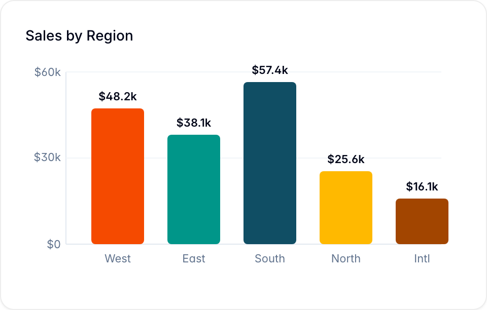
Bar Graphs
Create a bar graph to compare record values across the categories of one database.
A bar graph compares values across categories. The length of each bar represents the value for its category.
Create a bar graph
- Open a dashboard.
- Select Add chart > Bar Chart. Blue adds the chart and opens the Edit chart panel.
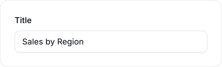
- Enter a Title.
- Under Database, select the database that holds the records. The fields in the other settings come from this database.
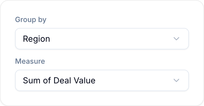
- Under Group by, select the field that defines the bars.
- If you selected a date, select an Interval: Day, Week, Month, Quarter, or Year.
- Under Measure, keep Records to count records, or select a numeric field.
- If you selected a numeric field, select its aggregation: Sum, Average, Minimum, Maximum, or Count.
- Optional: Select Add filters to limit the records in the chart.
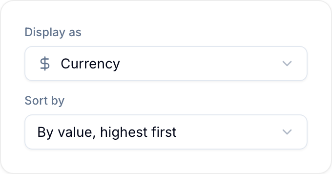
- Under Display as, select Number, Currency, or Percentage. Enter the number of Decimals.
- Select Save.
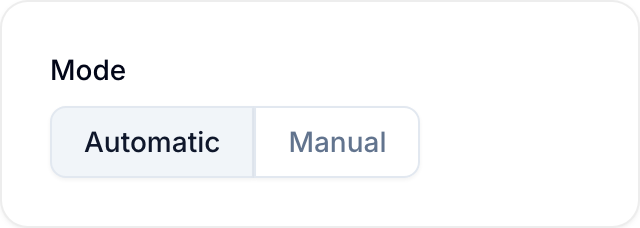
Blue adds the chart when you select the chart type. If you select Cancel, the chart stays on the dashboard. To remove it, open the chart menu and select Delete.
Group-by fields
The Group by list has these groups:
- Records: Record (one bar per record), Assignee, Tag, List, Status (Done/Not Done), Due Date, Created at, Updated at, and Completed at.
- Workspace: one bar per workspace.
- Custom Fields: the fields of the selected database with the type Select (single), Select (multi), Checkbox, Country, Date, Reference, Referenced By, or Assignee.
Status (Done/Not Done) uses the completion field of the database. List and Due Date use the database’s List and Due date fields. A database without these fields shows no bars for them. To group by any other field of the database, select it under Custom Fields.
Numeric fields for Measure can be Number, Currency, Percent, Rating, Formula, and Currency conversion fields.
Chart size limits
A chart has a maximum size. If your chart is above the limit, Blue tells you and does not draw it. Add a filter to decrease the number of records, or group by a field with fewer values.
| Chart | Maximum |
|---|---|
| Grouped by record | 100 bars |
| Any other group, no split | 1,000 bars |
| With a breakdown | 400 bars × slices |
If your chart shows more than one measure, the measures share the maximum. A chart with two measures can show one half of the bars.
You cannot use a breakdown when you group by record. Each bar is already one record, so there is nothing for the breakdown to divide.
Show more than one measure
Select Add next to Measure to add another measure. A bar, line, area, row, or combo chart can show up to six measures. When a chart has two or more measures, select Left or Right to choose the axis for each numeric measure.
A Combo Chart draws the first measure as bars and the other measures as lines.
Change the chart type
Use Chart type in the Edit chart panel to draw the same data as Bar, Line, Area, Row, Combo, Leaderboard, Table, Pie, or Funnel. Blue greys out a type that cannot draw the current data. Hover over the type to see the reason.
If the new type cannot use a setting, Blue removes the setting and shows which settings it removed.
On a line or area chart without a breakdown, select a Colour for each measure. Selecting a point on a line or area graph cross-filters the dashboard, the same as selecting a bar.
The same chart can also render as a leaderboard — a ranked table of exact values instead of a plot.
Stacked and 100% charts
Break each bar or band into segments to show what it is made of — records completed per assignee, budget per workspace, and so on. This adds a second grouping dimension on top of the one along the axis.
Stacking needs an additive measure: Records (a count) or a numeric field that is summed or counted. Averages, minimums, and maximums cannot be stacked, because their segments would not add up to the whole.
To stack a chart:
- Under Break down by, select the field that splits each bar into segments. You can break down by Status (Done/Not Done), Assignee, Tag, List, workspace, or a Select (single), Select (multi), Checkbox, Assignee, or Country field. Keep No breakdown for a plain chart.
- Under Stacking, select how the segments combine:
- Stacked: segments stack, so each bar’s height is the group total.
- 100%: each bar is normalised to 100%, showing the mix within the group rather than the total.
- Select Save.
When you break down by a field a record can hold more than once, such as tags or assignees, the record is counted once for each value, so the segments can add up to more than the group total.
Order the bars
By default, bars keep the order the data produces. Use Sort by in the Edit chart panel to arrange them:
- Value: rank the bars by their measure, largest or smallest first. This works on any grouped chart.
- Group name: sort the bars alphabetically by the name of the thing they are grouped by, A to Z or Z to A. This works on any grouping except a date. Bars are sorted by name but still grouped by identity, so two workspaces with the same name stay two bars.
- Name, Due date, Created at, Updated at, Status, or Manual order: available when you group by Record, because then one bar is one record.
A chart grouped by date cannot be sorted by group name. Its groups are labelled with dates such as Jan 2026, so A to Z would put April before January. A date axis already draws in date order.
A leaderboard is always ranked by value, highest first, unless you choose another order. Funnel charts cannot be reordered, because each stage is a subset of the one above it.
Show only the top groups
Use Limit in the Edit chart panel to keep only the first bars after sorting and leave the rest out of the plot. Select Top 5, Top 10, Top 20, Top 50, or Custom… to enter any number from 1 to 200. Select All to draw every bar.
A limit needs a sort order to decide which bars stay, so set Sort by first. The control stays disabled until the chart has an order. A leaderboard ranks by value on its own, so its limit is available immediately.
When a limit leaves something out, the chart says so below the plot:
- Showing top N of M when the bars are ranked by value, highest first.
- Showing first N of M for any other order, because the bars that stay are the first in that order, not the largest.
The limit changes the plot only. Statistic cards, funnels, and the chart’s scope caption still read every group, and a CSV export still contains every record the chart counted.
Edit a Bar Graph
Open the chart menu and select Edit. Blue opens the Edit chart panel. Change the settings, then select Save.