Pie Charts
Create a pie chart to compare proportional record values in one database.
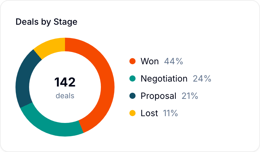
A pie chart shows proportional values as colored slices. Use it to compare categorized record data from one database.
Create a pie chart
- Open a dashboard.
- Select Add chart > Pie Chart. Blue adds the chart and opens the Edit chart panel.
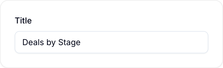
- Enter a Title.
- Under Database, select the database that holds the records. The fields in the other settings come from this database.
- Under Group by, select the field that defines the slices. Blue creates one slice for each value of the field.
- Under Measure, keep Records to count records, or select a numeric field.
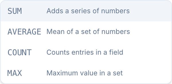
- If you selected a numeric field, select its aggregation: Sum, Average, Minimum, Maximum, or Count.
- Optional: Select Add filters to limit the records in the chart.
- Optional: Under Sort by, select an order for the slices. Under Limit, keep only the first slices.
- Under Display as, select Number, Percentage, or Currency. Enter the number of Decimals.
- Select Save.
A pie chart shows one measure. The Group by fields are the same as for a bar graph.
Numeric fields for Measure can be Number, Currency, Percent, Rating, Formula, and Currency conversion fields.
Charts with formula values
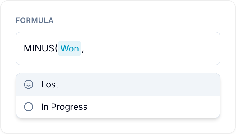
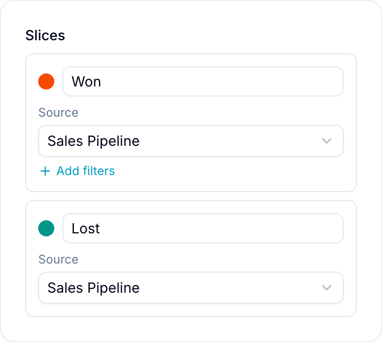
A chart can also calculate each slice from a formula. This applies to charts whose data section shows Edit formula instead of Group by. Select Edit formula to open the values editor. For the editor steps, see stat cards.