Fields on Front of Cards
Choose which standard and custom fields appear on board cards, and arrange them in the required order.
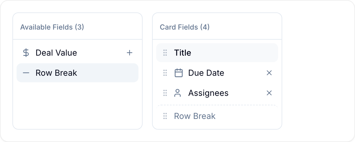
Card fields show record data directly on cards in the board view. Configure the fields and their order for each workspace.
Use Reset to Defaults when you want to restore Blue’s standard card configuration.
Open the card settings
- Open Workspace Settings > Card Interface.
- Find Available Fields on the left and Card Fields on the right.
The preview shows how the configured cards will appear.

Add a field
- Find the field in Available Fields.
- Enter a field name in the search box if you need to filter the list.
- Select + next to the field. Blue adds it to Card Fields.
You can add standard fields, custom fields, and supported time fields.
Remove a field
- Find the field in Card Fields.
- Select × next to the field. Blue moves it to Available Fields.
The Title field is required and cannot be removed.
Change the field order
- Point to a field in Card Fields.
- Drag its left grip handle to the required position.
- Drop the field. The preview updates immediately.
Arrange fields into rows
Two layout controls let you group card fields into rows instead of a single run:
- Row Break starts a new line. Fields after the break wrap to the next row.
- Divider starts a new line and also draws a line between the groups above and below it.
Add either control from Available Fields the same way you add a field, then drag it into position in Card Fields. You can add both controls more than once to build several rows. A divider with no fields after it does not render on the card.
Restore the default fields
Select Reset to Defaults at the bottom of Card Fields. Blue replaces the current configuration with these standard fields:
- Title
- Repeat Indicator
- Description
- Due Date
- Checklist Progress
- Comment Count
- Reminder Indicator
- Assignees
- Time in List
- Time in Project
- Tags
Supported fields
Standard fields
| Field | Description | Supported |
|---|---|---|
| Title | Record title; required | Yes |
| Description | Shows an indicator when a description exists | Reset only |
| Due Date | Displays the due date with color coding | Yes |
| Checklist | Shows completion progress, such as 3/5 | Yes |
| Comments | Displays the comment count | Yes |
| Reminder | Shows an indicator when a reminder is set | Yes |
| Repeat | Shows an indicator for repeating records | Yes |
| Assignees | Displays assigned member avatars | Yes |
| Tags | Shows assigned tags | Yes |
| Created at | Displays when the record was created | Yes |
| Updated at | Displays when the record was last updated | Yes |
| Completed at | Displays when the record was last completed | Yes |
| Time in List | Shows how long the record has been in its current list | Yes |
| Time in Project | Shows how long the record has been in the workspace | Yes |
| Dependencies | Does not render on cards | No |
| Referenced By | The legacy standard field does not render on cards | No |
| Workspaces | Does not render on cards | No |
| Last updated by | Can be selected in settings but does not currently render | No |
Custom fields
| Field Type | Supported | Notes |
|---|---|---|
| Single-Line Text | Yes | Displays the text value |
| Number | Yes | Displays the numeric value |
| Currency | Yes | Shows formatted currency |
| Currency Conversion | Yes | Shows the converted amount |
| Percent | Yes | Displays the percentage |
| Star Rating | Yes | Shows star icons |
| Checkbox | Yes | Shows the checked or unchecked state |
| Single Select | Yes | Displays the selected option as a badge |
| Multiple Select | Yes | Shows selected options as badges |
| Date | Yes | Displays the formatted date |
| Yes | Shows the email address | |
| Phone | Yes | Displays the phone number |
| URL | Yes | Shows the link |
| Country | Yes | Displays the country name or flag |
| Unique ID | Yes | Shows the automatically generated ID |
| Formula | Yes | Displays the calculated result |
| Duration | Yes | Shows the time duration |
| Location | Yes | Displays the location name |
| Reference | Yes | Shows the linked record |
| Referenced By | Yes | Shows records that link to this record |
| Lookup | Yes | Displays the value if the source field type is supported |
| Assignee | Yes | Displays assigned member avatars |
| Rollup | No | Does not currently render on cards |
| Table | No | Not available in Card Fields |
| Multi-Line Text | No | Too large for card display |
| Button | No | Requires interaction |
| File | No | Not suitable for a card preview |
When fields appear
Configured fields appear only when they contain data:
- Comments appears when
commentCount > 0. - Checklist appears when the record has checklist items.
- Due Date appears when a due date is set.
- Tags appears when tags are assigned.
Adding more fields makes each card taller. Put the most important fields first, and include only the fields needed to identify records.
Example configurations include deal value, stage, and close date for sales records. Other examples include priority and severity for bugs, publishing details for content, and onboarding progress for new employees.
You can also use Cover Images with card fields.